
Insights
How to Choose the Perfect Color Palette for Your Home
The Color That Changes Everything
Have you ever walked into an apartment and immediately sensed something—a feeling of well-being, warmth, or order—without being able to explain exactly why? Most likely, what you were perceiving was the magic of colors working in harmony with one another.
Color is the first thing the eye registers when entering a space. Before the furniture, before the fabrics, before any decorative objects: it is the color palette that defines a room’s character. Yet, when it comes to choosing colors for our own homes, most of us find ourselves overwhelmed by thousands of swatches, conflicting intuitions, and the fear of making a costly mistake.
It’s not just about aesthetics: colors influence our mood, our energy, and even the quality of our sleep.
In this guide, we’ll take you into the world of color palettes—from the harmony of complementary shades to the unwritten rules of great interior designers—to help you transform every room into a space that reflects who you are and makes you feel exactly how you want to feel. Are you ready to discover the power of color?
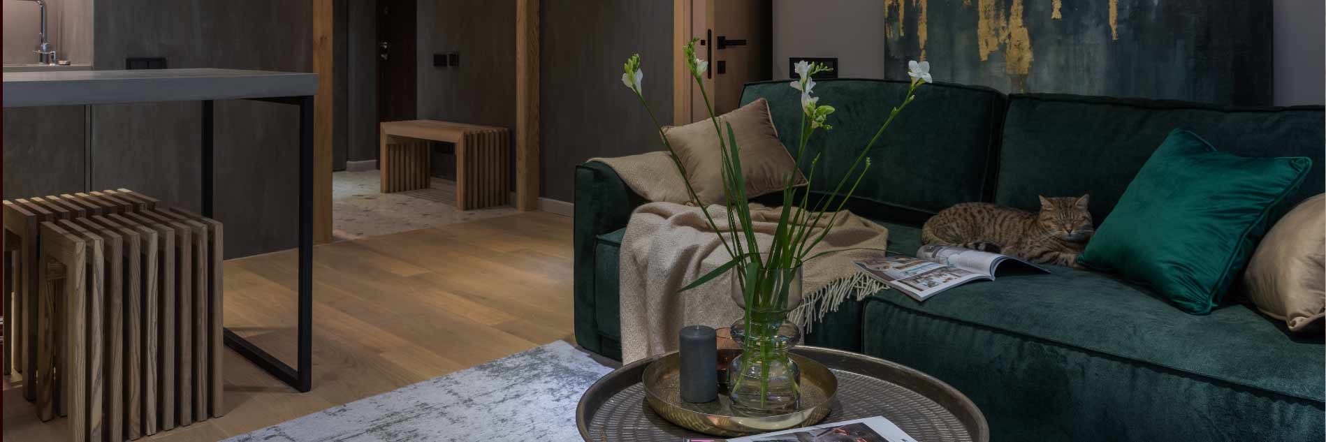
The golden rule of color: 60% – 30% – 10% is the secret to every harmonious space
Great interior designers don’t choose colors at random. Behind every space that conveys balance and visual coherence lies a principle as simple as it is powerful, born in the world of fashion and later adopted by interior design: the 60-30-10 rule.
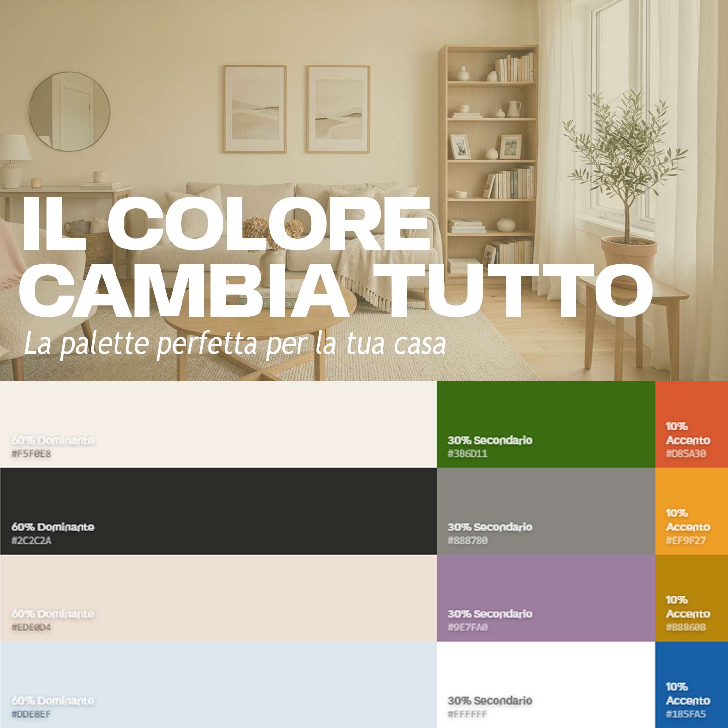
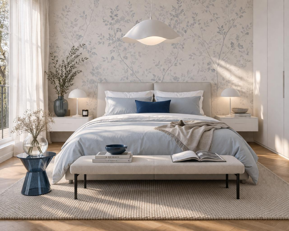
Here’s an example in the “Quiet Nordic” style:

It is a color proportion that divides the space into three distinct levels—dominant, secondary, and accent—assigning a precise percentage to each. The result? A palette that doesn’t strain the eye, that subconsciously guides the gaze, and that creates a cohesive experience in every room.
60% — The Dominant Color
The dominant color is the one that occupies most of the visual space: the walls, floors, sofas, and main furniture pieces. It is the chromatic foundation upon which everything else is built. Usually, a neutral or at least not overly bold shade is chosen—because it will be everywhere, and it must withstand hours and hours of exposure without becoming tiresome.
Think of the warm white of a Scandinavian living room, the slate gray of an urban loft, or the greige—a grayish beige—of a Mediterranean apartment: in all cases, it is the 60% that defines the space’s identity.
30% — The color that builds character
The secondary color occupies about a third of the space and serves to create depth, contrast, and personality. You’ll find it in curtains, rugs, a textured ceiling, the dominant fabric of a two-tone sofa, or in accent furniture like bookshelves and sideboards.
It must interact with the 60%—it can be complementary, analogous, or from the same color family in a more intense shade. It’s the color that, when you look at a room, makes you think: “Ah, that’s a choice.”
"The 30% is where personality comes into play without screaming. It’s the difference between a forgettable room and a memorable one."
The 10% — The color that surprises
Here it is: the detail that changes everything. The 10% is reserved for color accents—pillows, vases, plants, artwork, books, candles, drawer handles. They can be the boldest hue in the entire palette, the controlled point of contrast, the unexpected touch that makes a space Instagram-worthy.
Precisely because it is concentrated on small surfaces, the 10% can afford to be intense, brilliant, even provocative—without ever overwhelming the overall visual perception.
5 interior color palettes: real-world examples using the 60-30-10 rule
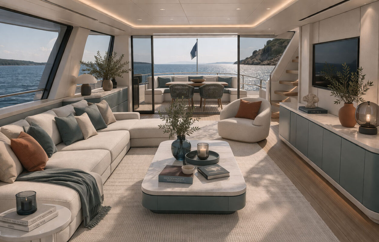
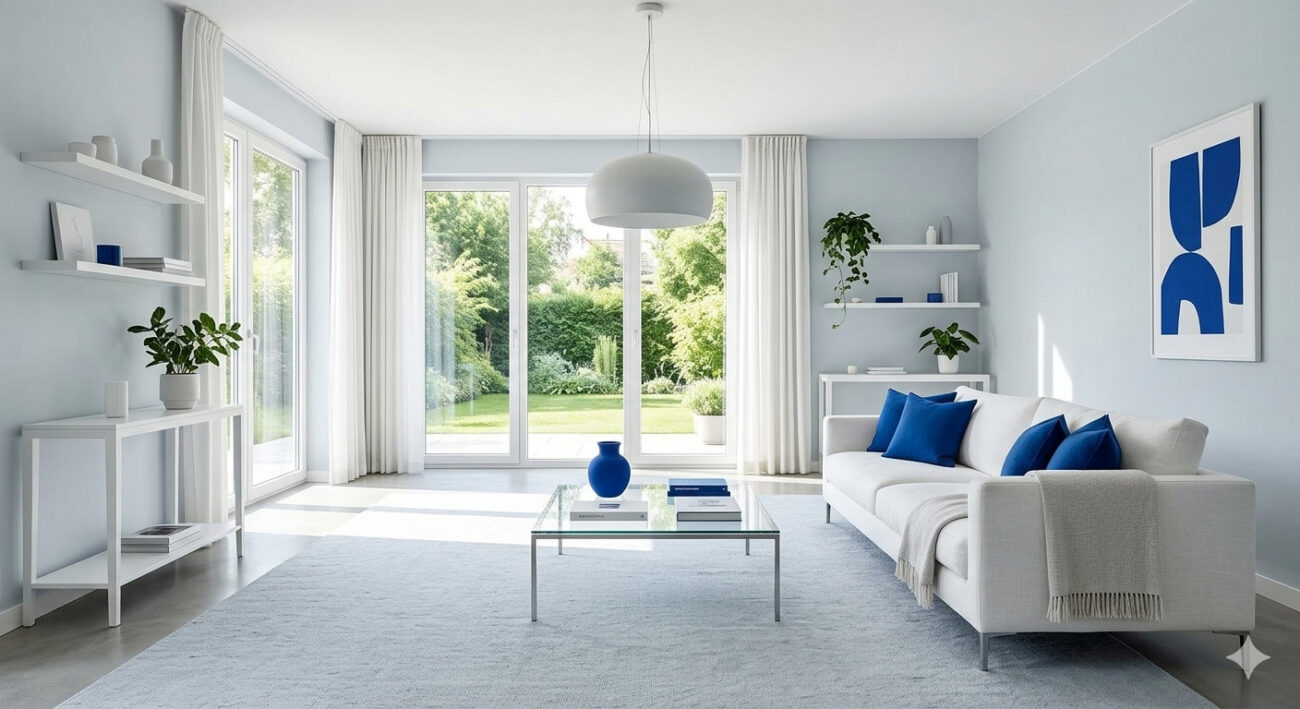
Coastal Modern

Misty blue on walls and trim, pure white for ceilings, lacquered furniture, and fabrics, deep ocean blue for pillows, throws, ceramic vases, and books. It breathes summer all year round.
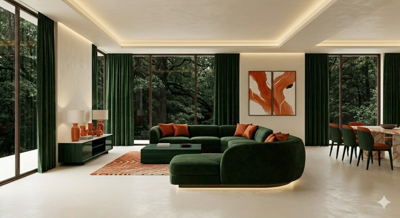
Mediterranean Botanic

Warm ivory white on walls and ceramics, deep forest green in plants, curtains, and stained wood furniture, coral-orange for ceramics, cushions, and artwork. Evokes a home by the sea.
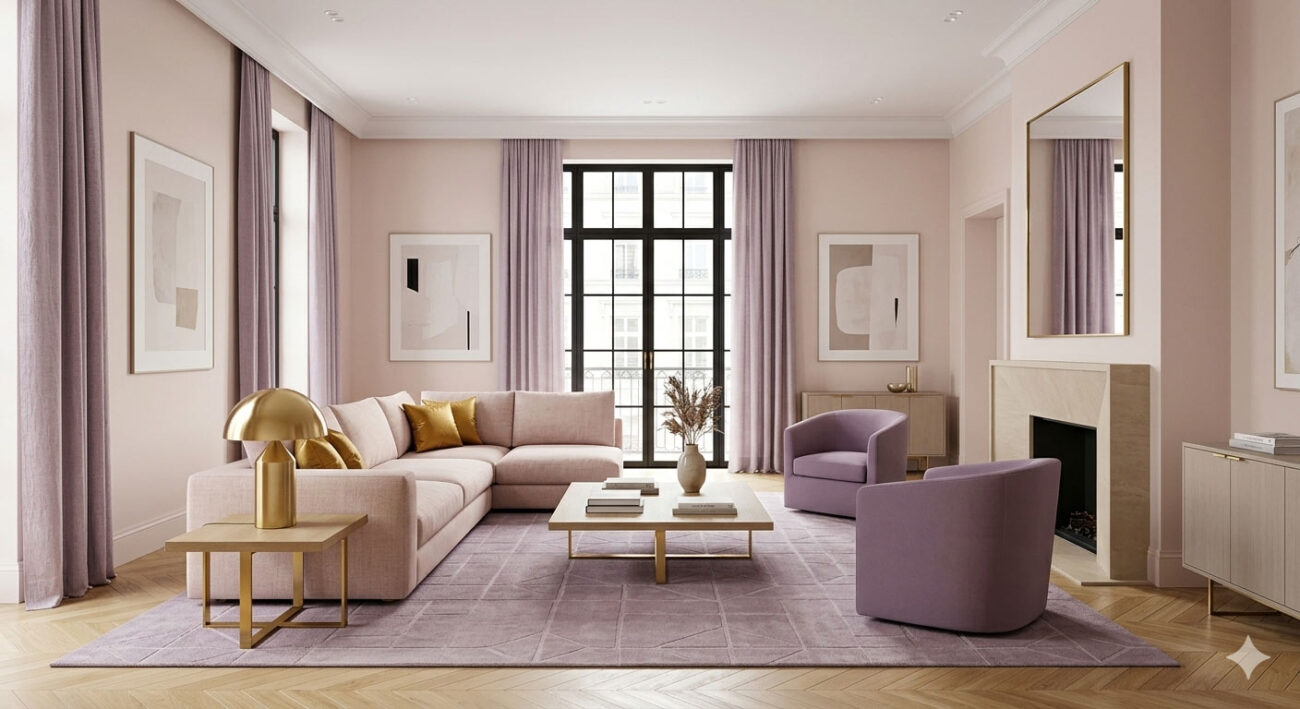
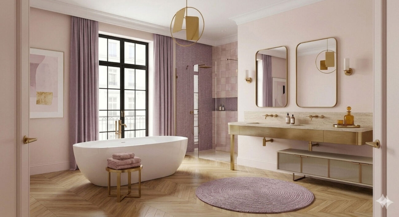
Romantic Parisienne

Antique powder pink for walls and linen sofas, mauve-lavender for curtains and rugs, antique gold for frames, mirrors, and decorative details. Fussy? Perhaps, but relaxing for sure.
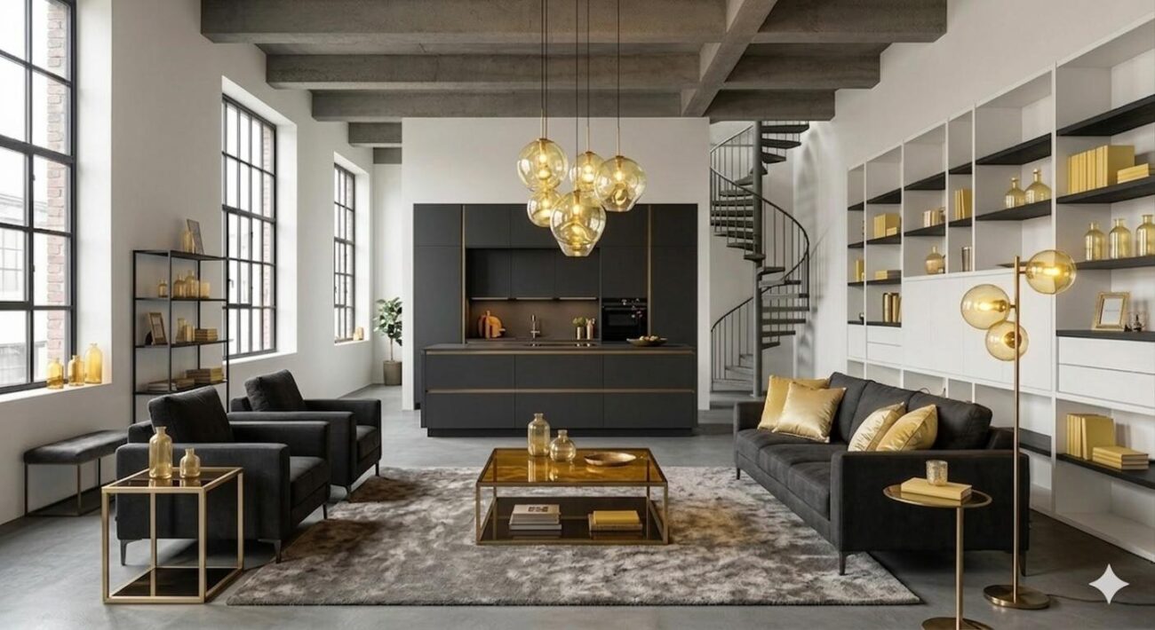
Urban Loft

Deep anthracite on walls and main furniture, medium gray for floors and rugs, golden amber for lamps, brass accents, and cushions. A seductive palette, just like in this post-industrial setting.
Modern Desert
Warm sand and travertine as the dominant base on walls, travertine flooring, linen sofa, and ceiling. Dark cocoa as a secondary tone for depth and texture, used for velvet curtains, the rug, bookshelves, and accent furniture; finally, plants, cushions, ceramic vases, and forest-green artwork serve as a vital accent. A palette that evokes the desert at dawn—silent, tactile, never cold. The green breaks up the earthy monochrome with a botanical touch that never grows tiresome.
The right color is built
The 60-30-10 rule is not a rigid formula to be applied mechanically but a mindset, a framework for thought, a way to train the eye to see space not as an empty void to be filled with separate objects, but as a coherent chromatic system, a harmonious guide in which every element carries precise weight.
What often holds us back when facing a room to furnish isn’t a lack of taste: it’s a lack of structure. We tend to buy pieces we like individually, without asking ourselves how they’ll interact with one another. The result is a space crowded with beautiful things that, however, don’t speak the same language.
With the 60-30-10 ratio, even the boldest color finds its place. That forest green that looks intimidating on the walls becomes perfect on three throw pillows. That orange that seems impossible to tame transforms into a ceramic vase that warms the entire room.
A final exercise:
The next time you walk into a furniture store, a museum, or a space you like, try looking at each object and asking yourself: is this a 60, a 30, or a 10?


